
Melon Admin Panel Redesign
One of the bigger projects I worked on before go-to-market was a redesign of our Admin Panel. We aimed to consolidate existing content within our new product, Melon, as well as evaluate the existing information architecture to ensure an intuitive user experience.
The goal of this project was to evaluate how content and UI Design could be improved by:
-
Reducing pain points
-
Increasing user engagement
-
Determining which information is most relevant to our customers’ needs
Design Process

01
Research Outline
The first step I took was defining our research goals and setting up a research outline to review with stakeholders. I created a project timeline that laid out all of the steps from contextual interviews leading up to product testing and implementation.
The following information details the process of the research plan I created to assess the viability of the current information architecture, as well as determine ways to improve discoverability of content in-line with FCTG’s business goals.
Goals:
-
Empower users by providing an easy-to-use interface for reporting and managing travel expenses.
-
Reduce travel costs for clients through customizable reporting and data interfaces.
-
Design goals/improving overall usability:
-
Improve existing information architecture
-
Increase engagement with features in-line with business goals
-
Improve discoverability of features that are helpful, and remove or redesign features that have less engagement.
-
02
Content Audit
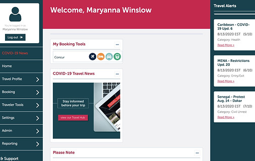
The administrative dashboard used by our parent product offered an all-in-one solution to corporate travel management. This platform allowed travelers to track expenses, access data and reports, and utilize helpful tools to make informed decisions when booking travel.
With the previous information architecture and design, navigating between pages and locating travel resources was cumbersome due to the amount of pages located within the dropdown menus in the local navigation. Doing a content audit would help me determine how many levels in our features were located in the platform, and how we might carry over the most important ones to be easier to locate.

-
Perform a content audit to familiarize with existing features in the tool.
-
Document existing features and their locations in the dashboard
-
Label Scoring: Evaluate current labels of content categories within the dashboard

03
Contextual Interviews
Once our content was audited, I scheduled remote contextual interviews with 10 of Flight Centre's existing client base for the following archetypes:
-
Security Admin
-
Duty of care and tracking travelers
-
-
HR Admin
-
Logistics coordination and travel program managers
-
-
Finance Admin
-
Manages spending and traveler budgets
-
Each archetype represented a different persona that were hoping to gain insight from for their specific use cases.
04
Affinity Mapping
Once contextual interviews were concluded, the data was compiled into an affinity diagram to better-assess the motivations and concerns for users accessing the dashboard. While the summary shown is not comprehensive (due to quotes and notes taken that contain private client data), this gave us an idea of how we might group together certain features within our new consolidated interface. Personas for each archetype were also created from this process.


05
Key Findings Summary
A Key Findings summary was created from the interview data and presented to stakeholders. This would include:
-
Project overview
-
Links to the interview data and spreadsheets
-
Participants linked to each finding
-
Details of the observations
-
Quotes from the participants.
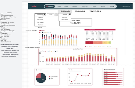
An example of my formatting and design for reports can be found in the image to the left.
06
Card Sort and Tree Testing
Presented with the key findings data, as well as the affinity diagram data, I created a card sort task as well as a tree test using Optimal Workshop to better understand where people expect content to be located in the dashboard.
The chart to the right is an example of where people expected to find certain features within the Admin Panel.


07
Protoypes & Usability
Once our Product Designer created the new interface, I coordinated usability sessions to test out designs with existing customers, as well as people who travel within the general population. My recruitment processes include Craigslist, LinkedIn, and Respondent.
I was responsible for analyzing data and ticketing design improvements for our designer to implement, as well as wireframing or creating mockups of simple changes in the UI in how we showed data on certain pages.
08
Final Design & Beyond
Our final design continues to be an ongoing project for improvements. We monitor feedback of our tool through NPS and surveys, and continue to reach out to clients to check in about any feature requests they would like to see.
